How to Draw a Birthday Cake Cartoon: Step-by-Step Guide
Artists say simple shapes raise recognition by up to 70% — a quick sketch can read like a full celebration if you plan smartly.
This Website contains affiliate links. That means I may earn a small commission if you purchase through my links, at no extra cost to you.
The goal here is clear: sketch a layered, playful cake that reads instantly as a festive image from any view. We’ll translate real decorators’ moves — drip glaze, bold outlines, candles, cherries, and sprinkles — into repeatable drawing steps.
Work in stages. Start with cylinders for tiers, add a grounding plate, and mark a slice cut-out to show inside texture. Thicken black outlines later to sell the comic style.
You will manage your time by choosing a fast sketch or a staged finish. Both let you keep shapes clean and colors suggest vanilla, strawberry, chocolate, or red velvet without overworking the drawing.
Key Takeaways
- Use simple shapes and strong outlines to make the design read at a glance.
- Plan tiers with cylinders and add a plate for clear grounding.
- Translate frosting and drips into bold, repeatable strokes.
- Choose a paced approach to save time and keep decorations clean.
- Map flavor colors to mood—whites, pinks, browns, and reds—to suggest texture.
Prep Your Canvas: Tools, Time, and Style Choices
Before you draw a single line, set up a clean workspace and gather the right tools. A short plan saves time and lifts overall quality. Pick smooth bristol or marker paper, HB and 2B pencils, a kneaded eraser, fineliners, and alcohol markers or colored pencils.
Work in stages like a decorator. Do a loose construction pass, refine contours, ink, then color. Treat each pass as a baking stage: prep, dry, assemble. This pace keeps details neat and decisions fast.
Choose style and scale
Decide a flavor palette—vanilla off-whites, warm chocolate browns, or bright strawberry pinks—to signal taste at a glance. Think about size on the page so tiers fit the view without crowding.
- Test fineliners on scrap paper to ensure crisp lines.
- Thumb-nail the composition so candles and drips don’t clash.
- For character themes, keep silhouettes simple for readable detail.
Sketch the Base: Layers, Size, and Simple Shapes
Start by mapping the cake’s main volumes with simple cylinders and clear guides. Draw a horizon line and a centerline to keep everything balanced.

Block each tier as a cylinder: a top ellipse, vertical sides, and a bottom ellipse. Keep ellipses consistent so top and bottom widths match per tier.
Block tiers and grounding
Stack tiers by reducing diameters slightly as you go up. This creates a small ledge that reads well in ink.
Add a round cake board a bit wider than the bottom tier and a plate under it to ground the drawing.
Indicate a slice and interior bands
Sketch two radial cuts from the top ellipse and pull out a wedge-shaped piece to show interior pieces. Inside the slice, alternate bands for cake and cream.
Dot a few crumbs near the cut and on the plate for charm. Before inking, correct symmetry and ensure verticals stay parallel.
| Tier | Typical Diameter | Sketch Notes |
|---|---|---|
| Bottom | 6–8 inches | Largest ellipse, add cake board for weight |
| Middle | 4–6 inches | Reduce diameter slightly; keep ellipses aligned |
| Top | 2–4 inches | Smallest cylinder; reserve space for candles |
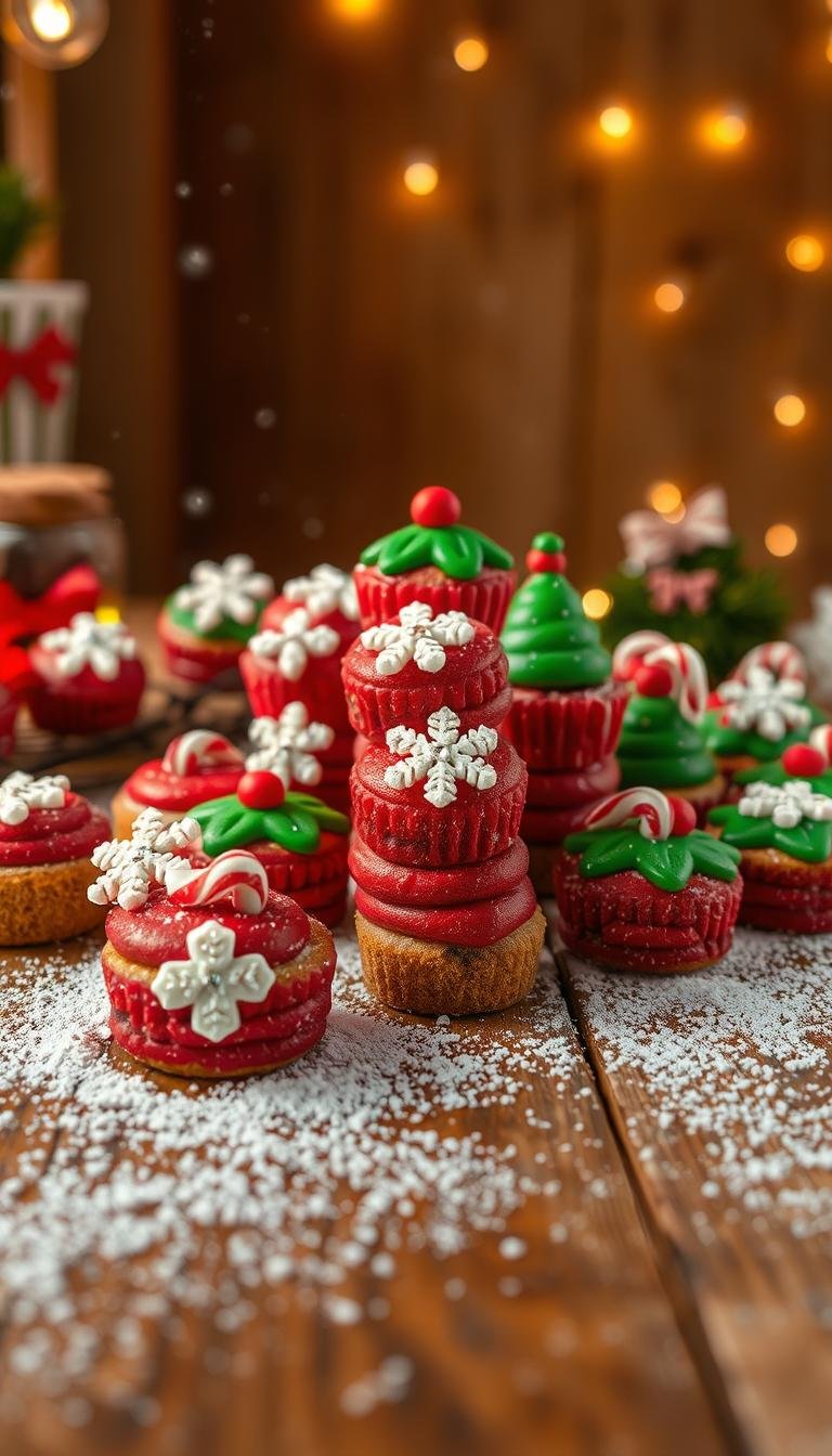
birthday cake cartoon: Add Drips, Frosting, and Decorations
Bring the sketch to life by focusing on a few strong details: a soft cream rim, a bold drip splash, and high-contrast pieces that read from across the room.
Draw smooth buttercream edges and a bold drip splash
Start the rim with a clean, rounded ellipse at the top tier. Add slightly bulging sides to suggest pressed cream.
Sketch drips as irregular, gravity-driven strands. Vary their length and curve the tips to imply weight. Thicken the underside of each drip to sell depth.
Candles, cherries, and sprinkles: build fun, high-contrast pieces
Keep candles simple: short cylinders on skewers with small flames and a center highlight. Stagger heights for energy.
Place cherries as tiny spheres with a top dimple and a single shine. Anchor them on small swirl dollops so they sit naturally.
- Use sprinkles sparingly—mix short bars and dots near the rim and plate edge.
- Pre-made circles and sugar pieces make clean, repeatable forms.
Character flair and quality outlines
For character poses, limit details to iconic shapes (Pikachu ears, Peppa’s snout) and avoid busy faces. This keeps the subject readable even at small size.
“Bold silhouettes and selective line weight make playful themes instantly recognizable.”
Vary line weight to build quality outlines: thicken the outer contour and drip edges, keep inner marks thin, and bold the slice edge for depth.
| Element | Tip | Priority if short on time |
|---|---|---|
| Drips | Vary length; thicken underside lines | High |
| Candles | Use skewers; stagger heights; add flame highlight | Medium |
| Cherries & sprinkles | Simple spheres and dots; avoid clutter | Medium |
| Character features | Keep silhouettes bold and minimal | High |
Color and Finish: Flavor, Texture, and Picture-Perfect Image
Let color and small highlights define texture and taste at a glance. Use clear flavor cues and controlled sheen to make your illustration read like a real dessert.

Color cues for flavour
Choose a palette that reads instantly. Warm off-whites suggest vanilla. Rosy tones point to strawberry.
Use rich browns for chocolate and deep reds for red velvet. These choices help viewers identify flavour quickly in pictures and thumbnails.
Shadows and highlights: cream sheen, glossy drip, matte surface
Differentiate surfaces. Keep the cake sides slightly matte with broad, soft shading. Make drips glossy with sharp highlights and narrow specular spots.
- Add curved highlights on cream dollops and gentle shadow bands beneath to imply airiness.
- Paint candle flames with a bright core and warm glow; add a faint halo on nearby cream for reflected light.
- Reserve pure white for the brightest specular hits on drips and cherries so the final image looks crisp in pictures and print.
“Small, well-placed highlights sell texture more than heavy renderings.”
If you are short on time, prioritize clean flat fills and a few high-value highlights. A tidy finish with selective contrast will still produce a picture-perfect result.
Conclusion
Finish smart: choose a clear silhouette, one strong drip, and a tidy highlight to sell the image. These three moves capture the staged approach pros use in baking and make your drawing read fast in pictures.
Work in stages—sketch, ink, color, accents—so each pass improves quality without overworking details. Ground tiers on a board and add a slice to show interior halves; this makes flavour and structure obvious at a glance.
Keep decorations bold and minimal—candles, cherries, and a few sprinkles—and scale up by a cup of visual space when you want more detail. When time allows, refine thick-thin linework and the drip edge to lift overall quality.
Practice variations—change tiers, swap flavours, or rotate the slice—to build speed and control. Save favorites as references; over a few sessions your cream textures and decorative rhythm will improve, and each new drawing will feel more confident.